
Finding A Direction
Through a series of conversations, we clarified what Hockey Media Belgium should stand for:
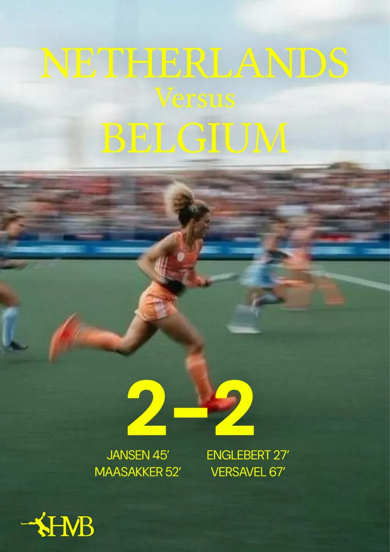
A classy media brand for the hockey obsessed, combining data and facts with stories and emotion.
That statement became the foundation for everything that followed.
[The Brief.]
Moodboards
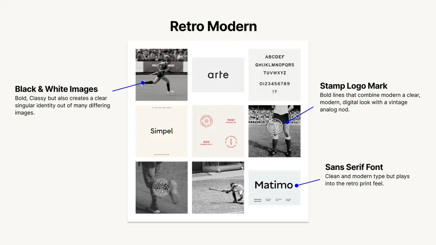
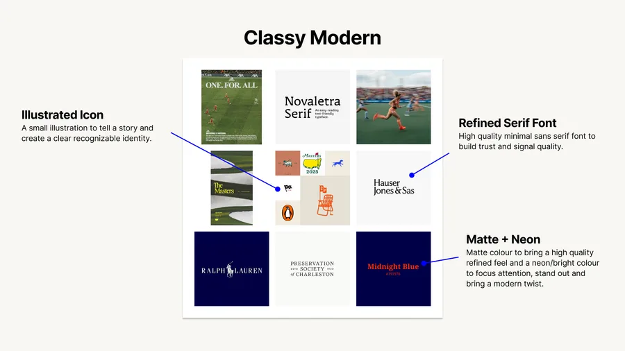
I explored two possible directions for the identity.
One leaned into a retro-modern aesthetic, using black and white photography, stamp marks, and bold typography. The other focused on a more refined and editorial feel, combining classical type with strong colours and subtle illustration.
Although I had a good sense of which direction would resonate most, exploring alternatives helped clarify what made the final choice feel right.
[Retro Moodboard.]
[Editorial Moodboard.]
Exploration
With the direction established, the work became an exercise in balance.
I explored different combinations of logos, typography, and colours to find the right relationship between trust and excitement, tradition and modernity.
[Development.]
Final Identity
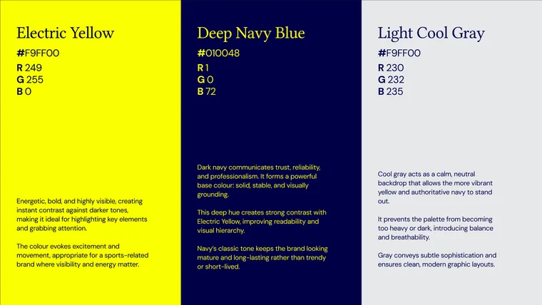
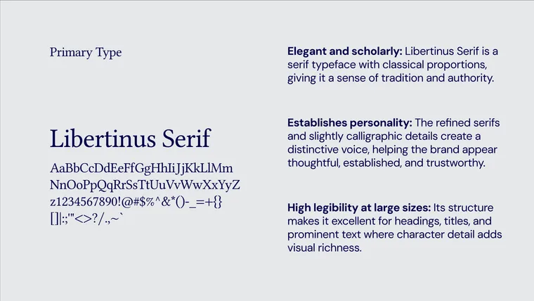
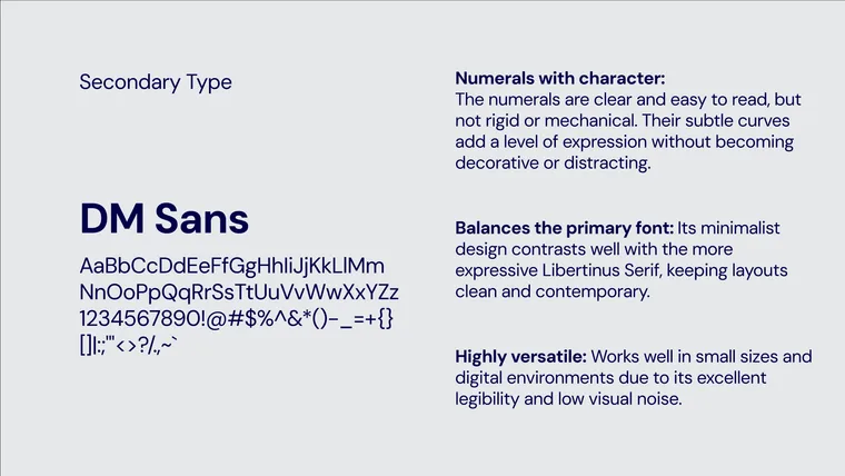
The final identity combines a distinctive monogram, classical typography, and a bold colour palette into a system that feels both established and energetic.
[Logomark.]
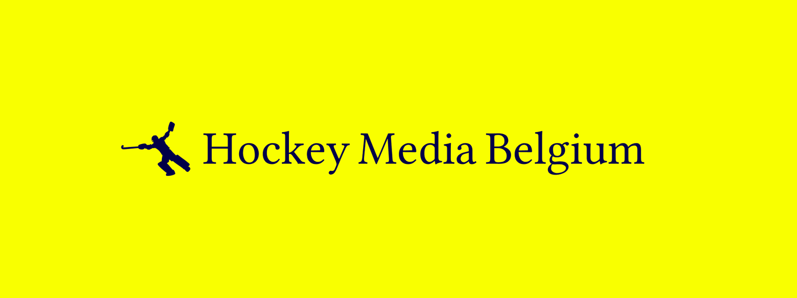
[Logotype.]
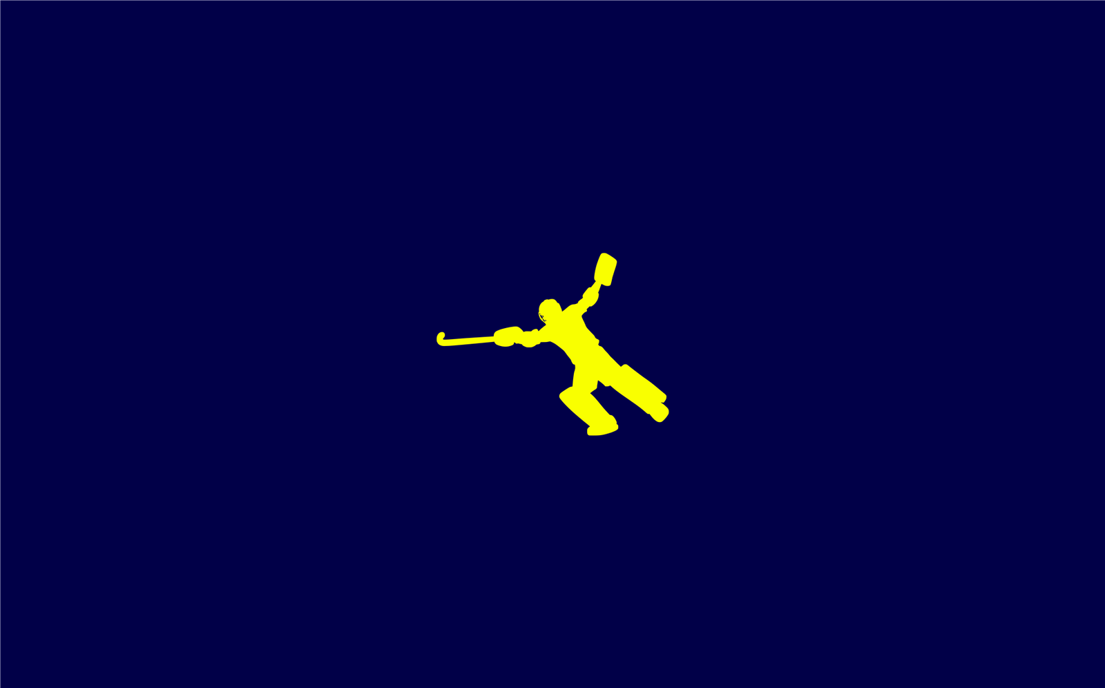
[Monogram & Icon.]
[Colour Palette.]
[Primary Type.]
[Secondary Type.]
Applications
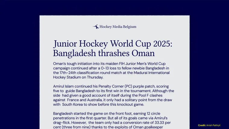
The identity was designed to work across articles, match graphics, and social content while maintaining a clear and recognizable voice.
[Brand In Use.]
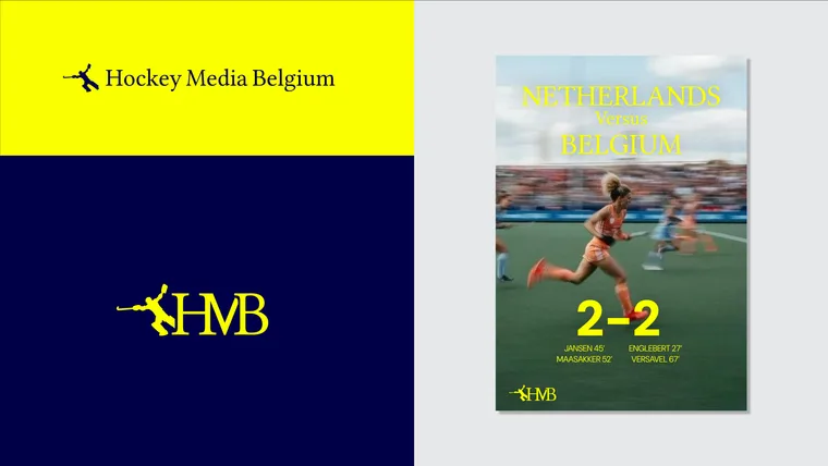
[Article Layout.]
Reflection
HMB taught me that people often understand what they want. They just need help expressing it.
Once we had a shared direction, every design decision became much simpler.
Other Projects
Springschaft
View project →The Autumn Society
View project →